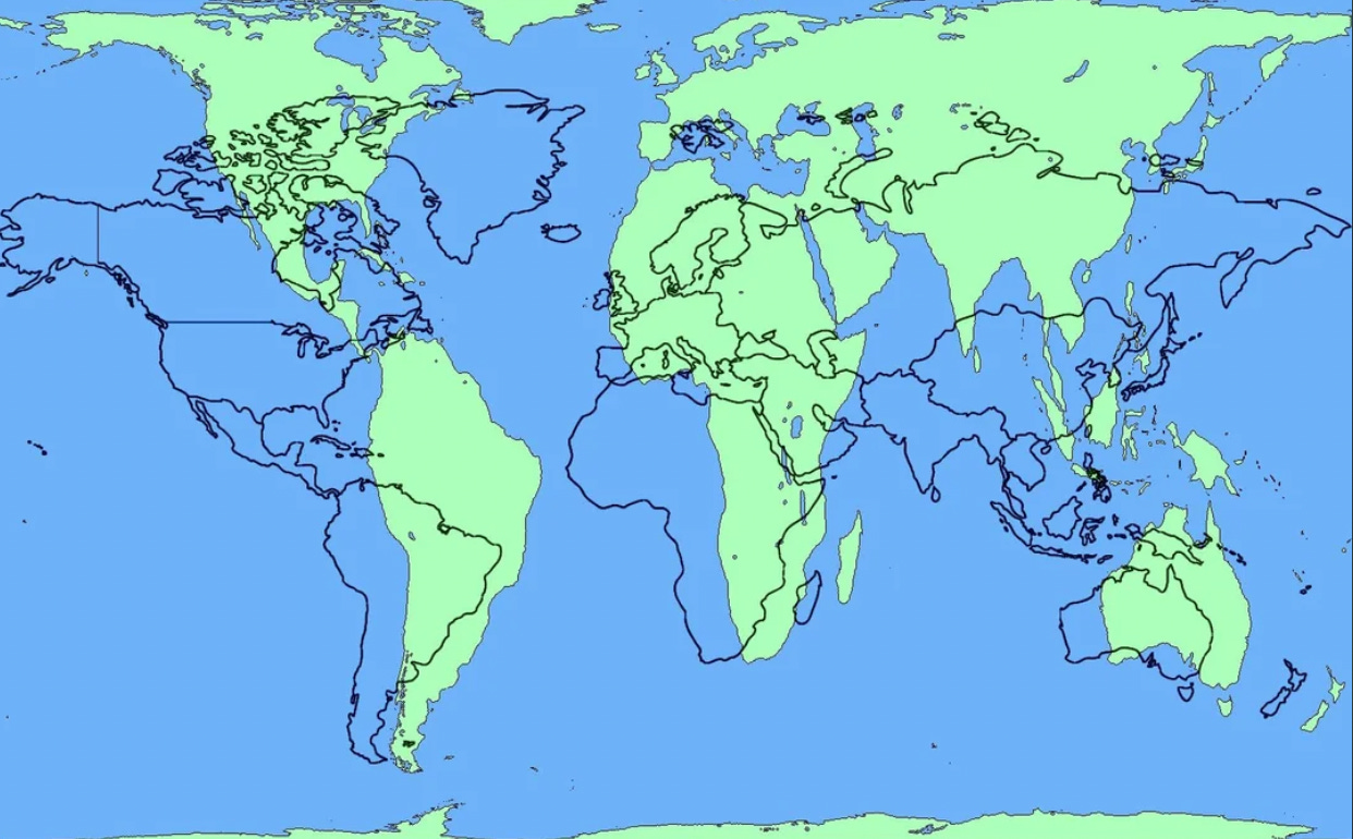
President Donald Trump’s election results are creating cognitive dissonance for pretty much everybody - for Democrats, for Republicans, for Americans, for non-Americans. There is one exception. Anyone who is compromised knows that the Trump team is coming for them. This means everyone, no matter how powerful, on the P Diddy and Epstein lists and everyone who has been engaging in corruption, making use of official positions or government money to break the law. This crowd is extremely aware of what’s coming and not at all confused about this. Everyone else has has an uneasy feeling of cognitive dissonance because nothing matches what they thought was going on. It’s as if everyone has suddenly begun to realize the mental map of reality they’ve relied upon without a second thought might be wrong.
The West Wing captured the problem perfectly ten years ago (please watch this clip).
We’ve been using the equivalent of The Mercator Map in the world of politics/geopolitics. But, the Mercator Map of the world is not what the world really looks like. It’s just a version of reality that was designed by a Flemish cartographer, Gerardus Mercator, in 1569. His goal was to make it easier for ships to find the shortest routes, which meant that it made sense to distort the map to maintain constant navigation angles. It served the purpose well, but the map makes the US and Europe look bigger than they are while making Africa and Latin America look a lot smaller than they really are. I realized something was wrong when I kept being surprised at how long it took me to fly from Capetown to London or from Washington, DC, to Sao Paolo. It takes longer than expected because my mental map is the Mercator Map. That’s the map we were taught in school. I had never even heard of the Peters Projection until The West Wing raised it in the above clip.
It’s a shock to realize that you are not where you think you are, and that something as basic as say Kansas isn’t where you thought it was. It is a shock to realize map design is arbitrary and can intentionally inflate the importance of some nations over others by making them look bigger or smaller than they are. Map designers pick a point of perspective to subliminally signal which nations are on the “top” versus those that are on the “bottom.” A map is not a fact. It is a perspective. Maps in America always have the US at the center. But the world is round, so the choice of center is random. So, I started looking at Stuart McArthur's Universal Corrective Map of the World (1979), which looks like this:
Now try this map of Earth, which shows The Pacific Ocean at the center. It’s all blue ocean. There is almost no land.
These maps give people cognitive dissonance. They make you say, “Where am I?” “Where is everything really?” Today, there is a true reckoning going on in politics that reveals the profound inaccuracies of our mental maps. The philosopher Daniel Schmachtenberger has been talking about this for a long time, saying we have a problem with the “information ecology”. Our core information is off. On election night, one Republican pundit referred to it as the “political information complex,” which has clearly failed us. No one can dead reckon our true location any more.
The data in this information complex is not just off but profoundly off. I expected this race to be truly historic, so I moved back to Washington, D.C., to get a front-row understanding of the situation. I found some incredible things about information ecology and reality mapping (not in order of priority).


